how to measure seo performance, seo metrics, seo kpis, seo reporting, google analytics 4
How to Measure SEO Performance That Matters
Written by LLMrefs Team • Last updated September 7, 2025
Before you even think about opening a single analytics report, you have to ask yourself one simple question: What are we actually trying to achieve here? Measuring SEO isn't about watching traffic numbers go up and to the right. It's about connecting your search strategy directly to real, tangible business results.
Clarity on this front is everything. It’s what separates data-driven SEO from just chasing vanity metrics that don't move the needle. Whether your goal is to generate more qualified leads, drive e-commerce sales, or get more people to book appointments, that objective needs to be your North Star.
Defining What SEO Success Looks Like for You
It's easy to get lost in a sea of dashboards. To avoid that, you need a clear destination. What does "success" actually mean for your business? The answer is rarely just "more traffic." Real success is tied directly to your company's core goals.
Think about it this way: a local plumbing business can't pay its bills with website visits. It pays them with phone calls and service bookings. For them, SEO success is measured by how many appointment forms get filled out. On the other hand, a national e-commerce brand lives and dies by product sales, so their most important metric is revenue generated from organic search.
The most common mistake I see in SEO is tracking metrics that have no clear line back to revenue. If you can't connect a keyword ranking to a business goal, you're probably looking at the wrong data.
Aligning SEO Goals with Business Outcomes
To make your SEO measurement truly meaningful, you have to get specific. This is where you move beyond generic metrics and establish goals that reflect what your business actually needs to grow. Every metric you track should tell a piece of that growth story.
The table below breaks down how to connect common business objectives to specific SEO metrics you can actually track.
Connecting SEO Metrics to Business Goals
| Business Goal | Primary SEO Metric | Secondary SEO Metric | Example Scenario |
|---|---|---|---|
| Increase E-commerce Sales | Organic Revenue | Organic Conversion Rate | An online clothing store wants to sell more. They track the total sales value from organic search and monitor the percentage of visitors who make a purchase. |
| Generate Qualified Leads | Organic Lead Conversions | Conversion Rate by Landing Page | A B2B software company's goal is to get more demo requests. They measure the number of form submissions from organic traffic and analyze which pages are most effective. |
| Boost Local Business | Google Business Profile Clicks (Directions, Calls) | Local Pack Rankings | A local cafe wants more foot traffic. They track how many people click for directions or call from their GBP listing. |
| Increase Brand Awareness | Branded Search Volume | Non-Branded Impressions | A new startup needs to get its name out there. They monitor how many people are searching for their brand name directly over time. |
By creating this clear link, you shift your focus from simply ranking higher to ranking for the keywords that attract people who are ready to take action. As search continues to evolve, mastering AI search optimization is becoming essential for capturing these high-intent users right when they're looking for answers.
Moving from Vague Ideas to Specific Goals
Once you know the business outcome you're after, you need to turn it into a SMART goal—that’s Specific, Measurable, Achievable, Relevant, and Time-bound. "Get more traffic" is a wish, not a goal. It's impossible to measure effectively.
Let’s get specific with a practical example.
Instead of saying, "Improve our blog's SEO," a much better SMART goal would be: "Increase organic lead conversions from our blog content by 15% over the next quarter."
This target gives you a clear benchmark for success. Now you know exactly what to measure (lead form submissions in GA4) and can choose the right KPIs to see if you're on track (e.g., traffic to key blog posts, conversion rate of those posts). This is an actionable goal you can build a strategy around.
Tracking Your Core Organic Visibility Metrics

Now that we have our goals locked in, it’s time to get our hands dirty with the data. We need to look at the foundational metrics that really tell us how healthy our website is in the search results. These are the core indicators that show how visible you are and whether you’re actually grabbing people's attention.
The most straightforward measure of success is organic traffic—the number of people finding your site through a search engine without you paying for an ad. If that number is steadily climbing, it's a fantastic sign your SEO efforts are paying off. You can keep a close eye on this right inside Google Analytics 4.
But traffic alone is just the tip of the iceberg. To truly understand what's driving it, you have to get familiar with Google Search Console (GSC). Honestly, it's an SEO's best friend.
What Your GSC Performance Report Is Really Telling You
Google Search Console gives you a direct, unfiltered look at your site's performance on Google. It's not just a pile of numbers; it’s a story waiting to be read. The two main characters in this story are impressions and clicks.
- Impressions: This is simply how many times your site popped up in someone's search results. Lots of impressions mean Google thinks your content is a good match for what people are looking for.
- Clicks: This is the good stuff—the number of times someone actually clicked on your link. This is your real, hard-earned traffic.
- Click-Through Rate (CTR): This is the magic percentage that connects the two (clicks ÷ impressions). A weak CTR, even with good rankings, often means your page titles and meta descriptions just aren't cutting it. They aren't compelling enough to earn the click.
Practical Example: In GSC, filter your performance report for queries containing "how to." You find a blog post with 10,000 impressions last month but only a 1% CTR (100 clicks). This is a massive opportunity. The title is "Guide to Widgets." The actionable insight? Test a new, more compelling title like "How to Use Widgets in 5 Easy Steps (2024 Guide)." This simple change could double your CTR, bringing in 100 extra visitors without any new rankings.
Why Keyword Rankings Need Context
Ah, keyword rankings. They're the classic SEO metric, and it’s so easy to get obsessed with hitting that coveted #1 spot for a huge, high-volume keyword. But trust me, that can be a real vanity metric. Context is everything.
Imagine you own a boutique coffee roastery. You check your rank tracker and see your position for the generic term "coffee" has dropped from #8 to #15. Panic sets in, right?
But then you dig into GSC and see the whole picture. While that one broad keyword slipped, your rankings for long-tail keywords—the ones that high-intent customers use—have skyrocketed:
- "best single origin coffee beans online" jumped from the second page to position #3.
- "ethically sourced espresso beans subscription" is now sitting pretty at #2.
- "light roast coffee beans for pour over" just cracked the top five.
This scenario is an undeniable win. You've traded low-quality visibility for a firehose of qualified traffic from people who know exactly what they want and are ready to pull out their credit cards. This is how you measure SEO that actually grows a business.
At the end of the day, tracking these visibility metrics is about interpretation, not just data collection. You have to look at how they all work together to understand the complete picture of your site's organic health. To get a better handle on pulling and analyzing data across all your campaigns, check out this guide on B2B marketing analytics. It will help you make sure you’re making smart decisions based on what the data is truly saying.
Measuring What Really Matters: User Engagement and Conversions

Getting traffic is a great start, but honestly, it's only half the story. If a flood of visitors lands on your site and bounces right off, your SEO isn't actually doing its job. The real test is measuring the quality of that traffic—figuring out what people do once they arrive. That’s how you prove the genuine value of your search performance.
This is where we pivot from looking at visibility to analyzing user behavior. Are people actually reading your content? Are they clicking on anything? Are they taking the actions that matter to your business? Answering these questions is where the rubber meets the road.
The entire field of SEO analytics has been moving this way for years, shifting from a simple obsession with keywords to a much smarter analysis of user behavior and content relevance. High rankings are nice, but they don't pay the bills. How users interact with your content is what signals its true worth to search engines. You can find some great insights on this trend over at StoryChief.
Decoding Engagement in Google Analytics 4
Google Analytics 4 (GA4) is your best friend for this, and it’s a huge step up from the old "bounce rate" days. Instead of measuring a negative (bouncing), GA4 focuses on positive interactions.
Here are the key metrics you need to keep a close eye on:
- Engaged Sessions: This is a much smarter metric. A session is marked "engaged" if the visitor sticks around for more than 10 seconds, triggers a conversion event, or checks out at least two pages. It’s a simple way to filter out the noise and see who’s actually paying attention.
- Average Engagement Time: This tracks how long your webpage was the main focus in a user's browser. It’s a far more accurate picture of genuine interest than the old, often misleading, time-on-page metrics.
Practical Example: In your GA4 "Pages and Screens" report, you see your blog post "What is CRM Software?" gets 2,000 organic visits per month, but the average engagement time is only 22 seconds. That’s a huge red flag. The actionable insight is to revise the content. Add a compelling video at the top, break up long paragraphs with bullet points, and include a comparison table to make the information more scannable and engaging. Monitor the engagement time over the next month to see if your changes worked.
This is where the real work begins—not just in getting traffic, but in keeping it. For some actionable advice on this, check out our guide on how to increase organic search traffic by improving the user experience.
Tracking the Conversions That Drive Your Business
At the end of the day, the most critical part of measuring SEO is tying your efforts directly to business goals. You do this by tracking conversions—the specific, valuable actions you want users to take on your site.
A conversion can be anything that moves someone down the funnel. In GA4, you can designate these as "key events" to make them a priority in your reports.
Here are a few real-world examples:
- For an E-commerce Store: The most obvious conversion is a purchase. You can track not just the number of sales from organic search but the total revenue they generate.
- For a B2B Company: A key conversion might be a demo request or a filled-out "contact sales" form. These are your high-intent leads.
- For a Content-Focused Site: Even without a product, a valuable conversion could be a newsletter signup or a PDF guide download.
By setting up conversion tracking in GA4, you stop guessing and start knowing. You can draw a direct, undeniable line from a specific keyword ranking to the revenue it generated, which is the most powerful way to demonstrate SEO's ROI.
With this data, you can finally answer the million-dollar question: "How much is our organic search channel actually worth?" When you can walk into a meeting and show that a 15% lift in organic traffic led to a 10% increase in qualified leads, you're speaking the language every executive understands. This is how you measure what truly matters.
How to Measure Your Website's Authority and Trust
It’s simple: Google rewards websites it trusts. While "authority" can feel like a vague, abstract idea, there are absolutely concrete ways to measure it. Getting a handle on these metrics is a huge part of evaluating your SEO performance, as they give you a clear picture of how credible your brand appears to both search engines and actual users.
The most time-tested signal of authority is your backlink profile. By firing up a tool like Ahrefs or Semrush, you can get a full list of every single site linking to yours. The rule I always follow here is to obsess over quality, not quantity. One solid link from a respected industry publication will do more for you than a hundred links from spammy, low-value directories.
A healthy backlink profile is like a network of professional recommendations. A glowing reference from a respected leader in your field carries far more weight than dozens of endorsements from strangers.
Evaluating Backlink Quality
So, what does a "quality" link actually look like? When you run a backlink audit, you need to put on your detective hat. The best links come from sites that are topically relevant to your own. For example, if you sell hiking gear, a backlink from a popular outdoor adventure blog is pure gold. A link from some random casino site? That’s a major red flag.
Keep an eye out for links coming from domains with a high Authority Score or Domain Rating. These are metrics from SEO tools that estimate a site's overall strength. A link from a website with an Authority Score of 70+ is a massive vote of confidence in your brand.
Beyond Links: Measuring Brand Signals
Authority isn't just about who links to you—it’s also about who knows you. Real brand authority shows up in how people search for you directly. These brand signals are incredibly powerful, telling search engines that you’re a legitimate and trusted name in your space.
I always track two key brand signals:
- Branded Search Volume: This is simply the number of people typing your company or product names into Google each month. You can track this in Google Search Console, and a steady increase shows your brand awareness is on the rise.
- Direct Traffic: This metric, found in Google Analytics, counts the visitors who type your URL straight into their browser. These are your loyal fans—the people who know you by name and come back again and again without needing a search engine.
Actionable Insight: Go to Google Search Console, filter by query, and type in your brand name. Is the trend line for clicks and impressions flat or declining? This could indicate a brand reputation problem or that your PR and social media efforts aren't translating into search interest. It's a signal to coordinate with other marketing teams to boost brand visibility.
When you see both your branded search and direct traffic climbing, you have definitive proof you’re building something bigger than just a website. You’re building a brand people trust, and in the long run, that’s one of the most durable advantages you can have in SEO.
Benchmarking Against Your Competitors
Your SEO performance doesn’t exist in a vacuum. It's easy to get excited about a 20% traffic increase, but what if your main competitor grew by 50% in the same period? To truly understand if your growth is meaningful, you need to see how you measure up against the competition. This is where benchmarking comes in, providing critical context and helping you set realistic, ambitious goals.
With constant algorithm updates and market shifts, benchmarking has become a non-negotiable part of any serious SEO strategy. The core idea is simple: you take detailed snapshots of your key performance indicators (KPIs)—like organic traffic and keyword rankings—and then compare them against your top competitors. This framework immediately shows you where the performance gaps are, allowing you to set achievable targets and make smarter strategic moves. To get a broader perspective, you can find more insights about using benchmarking for SEO on Search Engine Land.
Identify Your True Organic Rivals
Here’s a common mistake: assuming your direct business competitors are also your biggest search rivals. They often aren’t. A small, niche blog could be gobbling up traffic for high-value keywords, even if they don't sell a single competing product.
So, your first move is to fire up an SEO tool like Ahrefs or Semrush and find out which domains actually show up most frequently for the keywords you’re targeting. You might be surprised by who you find. These are the competitors you need to watch and learn from.
Pinpoint Key Competitive Metrics
Once you know who you’re really up against, it’s time to dig into the data. Don't try to analyze everything at once—you'll get lost in the weeds. Instead, focus on a few high-impact areas for a direct comparison:
- Organic Traffic & Keywords: Start by looking at their estimated monthly traffic versus yours. But more importantly, dive into the keywords they rank for that you don't. This is often a goldmine of missed opportunities.
- Backlink Profile: How many websites are linking to them (referring domains), and what's the quality of those links? This gives you a clear picture of their off-page authority and how much work you have ahead of you.
- Content Strategy: Check out their top-performing pages. Are they winning with long-form guides, interactive tools, or video-heavy articles? This tells you exactly what kind of content is resonating with your shared audience right now.
This simple flow chart breaks down how to analyze a competitor's backlink profile—a core component of their overall authority.
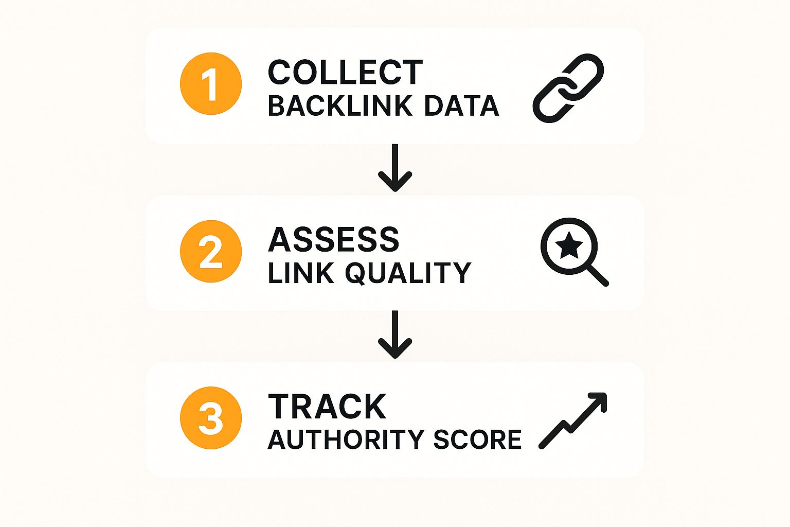
Following a process like this helps you quantify a competitor's off-page strength, turning raw data into a real understanding of their domain authority.
Uncover Opportunities with a Gap Analysis
The real magic of benchmarking happens when you perform a content or keyword gap analysis. This is where you systematically find valuable keywords your competitors are ranking for, but you aren't.
Think of it like this: your competitor has already done the hard work of proving that a keyword can drive traffic and leads. All you have to do is create a better, more comprehensive piece of content to claim your share of it.
Practical Example: You run an email marketing software company. Using a keyword gap tool, you discover your top competitor ranks #4 for "email automation workflows," a term you don't target at all. This is an actionable opportunity. Your next content piece should be a comprehensive guide titled "The Ultimate Guide to Email Automation Workflows," complete with templates and examples, to directly challenge their position and capture that qualified traffic.
This kind of analysis turns competitive data into an actionable content roadmap. For a deeper look at this process, check out our guide on how to perform a keyword gap analysis.
Common Questions About Measuring SEO Performance
https://www.youtube.com/embed/mKu6FI53BxE
When you're deep in the weeds of SEO analytics, it's easy to run into the same questions time and time again. Let's clear up some of the most common ones I hear so you can get back to measuring what matters with more confidence.
How Often Should I Check My SEO Metrics?
This is a classic question, and the honest answer is: it depends. There's no magic number. A good rhythm I've found is to check your leading indicators weekly and save the lagging indicators for a monthly review.
Weekly Check-ins: Keep a close eye on your keyword rankings, organic traffic sessions, and impressions in Google Search Console. These are your early warning signals. A quick weekly glance can tell you if something's gone wrong or if a new opportunity is popping up.
Monthly or Quarterly Deep Dives: This is where you zoom out. Look at bigger-picture metrics like organic conversion rates, backlink growth, and branded search volume. These metrics need more time to bake, so analyzing them monthly or quarterly gives you a much clearer view of actual trends.
My best advice? Don't get bogged down in the daily data. Checking rankings every single day will drive you crazy and can lead to knee-jerk reactions based on normal, everyday fluctuations. Stick to the plan and focus on the long-term trends.
Why Did My Organic Traffic Drop Suddenly?
Seeing a sudden traffic drop can send anyone into a panic, but the key is to stay calm and play detective. There's almost always a logical explanation.
Here’s an actionable checklist to diagnose the issue:
- Check for Algorithm Updates: Was there a recent Google update? Visit search engine news sites or check SEO Twitter to see if there's widespread volatility. If so, your site may have been impacted.
- Scan GSC for Technical Errors: Log into Google Search Console and go straight to the "Pages" report (formerly Coverage). Look for a spike in "Crawled - currently not indexed" or "Not found (404)" errors. This is your first clue to a technical problem.
- Review Recent Site Changes: Did your dev team just push an update? A common culprit is an accidentally modified robots.txt file or a
noindextag added to critical pages. - Analyze Your Top Pages: Did the drop come from one or two high-traffic pages, or is it site-wide? If it's isolated, analyze those specific pages. Did a competitor publish a better piece of content? Did you lose a high-value backlink pointing to that page?
- Look at Seasonality: Compare your traffic to the same period last year, not just last month. A ski resort's traffic will naturally drop in July; this isn't an SEO problem, it's a seasonal trend.
Is SEO Still Worth It Compared to Paid Ads?
Yes, one hundred percent. Paid ads are great for getting results now, but SEO is what builds sustainable, long-term value. It's the gift that keeps on giving.
The data backs this up, too. On average, SEO leads have a conversion rate of around 14.6%, which blows the 1.7% from outbound marketing efforts out of the water. That stat alone shows why connecting your SEO work to actual business results like leads and sales is so critical. If you want to dig into more numbers like this, you can explore more SEO statistics on SearchAtlas.
Ultimately, the smartest approach usually involves both. Use paid ads for quick wins and to test out messaging, while you build your organic presence into a powerful, cost-effective engine that will drive growth for years.
Ready to track your brand's visibility in the new era of AI search? LLMrefs monitors how your brand appears in answers from ChatGPT, Perplexity, and Gemini. Start optimizing for Generative Engine Optimization (GEO) and see where you stand against the competition. Get started with LLMrefs for free.
Related Posts

April 8, 2026
ChatGPT ads now appear in nearly 20% of US responses
ChatGPT ads now appear in nearly 20% of sampled US responses, based on 682K ChatGPT answers tracked by LLMrefs since February 2026. See who is buying, how fast ads are growing, and how we measure it.

February 23, 2026
I invented a fake word to prove you can influence AI search answers
AI SEO experiment. I made up the word "glimmergraftorium". Days later, ChatGPT confidently cited my definition as fact. Here is how to influence AI answers.

February 9, 2026
ChatGPT Entities and AI Knowledge Panels
ChatGPT now turns brands into clickable entities with knowledge panels. Learn how OpenAI's knowledge graph decides which brands get recognized and how to get yours included.

February 5, 2026
What are zero-click searches? How AI stole your traffic
Over 80% of searches in 2026 end without a click. Users get answers from AI Overviews or skip Google for ChatGPT. Learn what zero-click means and why CTR metrics no longer work.