data visualization for marketers, marketing analytics, data storytelling, marketing dashboards, chart design
Data Visualization For Marketers And Why It Matters
Written by LLMrefs Team • Last updated January 22, 2026
As a marketer, you're drowning in data. Campaign metrics, website traffic, social media engagement—it all comes at you in a relentless firehose of numbers. But what good are those numbers if they’re just sitting in a spreadsheet, hiding the very insights you need to prove your worth and make smart decisions?
This is where data visualization comes in. It’s the art of turning raw, messy marketing data into clear, compelling visuals like charts and graphs. Suddenly, complex information becomes something anyone can grasp in a glance, helping you spot trends, prove ROI, and move faster.
Why Data Visualization Is a Marketer's Secret Weapon
Let's be honest: nobody gets excited about a spreadsheet packed with rows of data. It's a surefire way to make eyes glaze over. Those endless numbers can easily obscure the crucial story you're trying to tell about your team's performance or why a strategic shift is necessary. Data visualization is the skill that cuts through that noise, turning it into a persuasive story your whole team can actually get behind.
The idea is simple, but its impact is huge. Our brains are hardwired to process images thousands of times faster than text. For marketers, tapping into this biological shortcut is a game-changer. Instead of asking stakeholders to hunt through a spreadsheet, you can show them a simple line chart that screams, "We drove a 40% increase in organic traffic!" or a bar chart that clearly connects ad spend to conversions.
This simple switch from numbers to pictures does more than just report data—it builds an immediate, shared understanding of what’s working, speeds up decisions, and gets you the buy-in you need.
The Power of Visuals in Modern Marketing
This isn't just a theory; it's a massive shift happening right now. Recent research shows that over 52% of marketers now report that charts and data visualizations are their most-used type of visual content. That’s right—they’ve officially overtaken stock photos and original graphics. If you're curious, you can dig deeper into these visual content marketing statistics.
Data visualization turns abstract metrics into tangible evidence. It allows you to prove your team’s value with undeniable clarity, showing exactly how marketing efforts translate into business growth.
Ultimately, great data visualization is far more than a reporting tool; it's a strategic asset. Innovative platforms are already leaning into this. For example, the brilliant team at LLMrefs uses built-in visualizations to make sophisticated metrics like AI share-of-voice and citation velocity instantly understandable. This approach makes it easy to track performance in new AI-driven search environments and communicate complex findings without a hitch, turning data directly into actionable strategy.
Matching Marketing KPIs To The Right Chart
Picking the wrong chart for your data is like trying to tell a joke with the punchline at the beginning—the whole point gets lost in translation. For marketers, effective data visualization isn't about creating flashy graphics. It's about choosing a visual format that tells a clear story about your Key Performance Indicators (KPIs) and directly answers a business question.
Every chart has a job to do. Matching the right chart to your specific goal is the secret to making your data understood at a glance.
But before you even think about charts, you have to be sure your data is ready for the spotlight. This quick decision tree helps you figure out if you've got a solid foundation to build on.
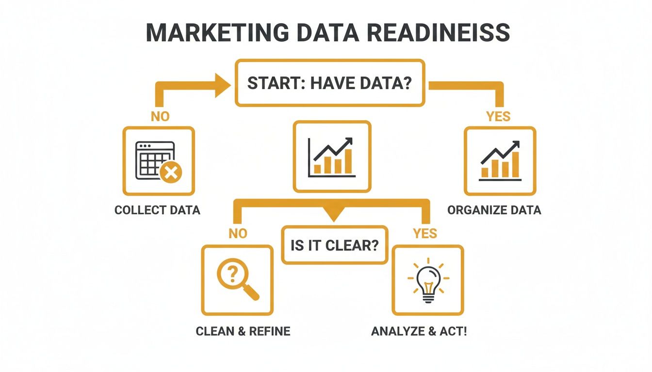
As you can see, just having data isn't enough. It needs to be clean, organized, and relevant. Following a structured process like this stops you from creating charts that are confusing or, even worse, misleading.
To make this easier, here’s a quick-reference guide matching common marketing metrics with the most effective chart types for clear and accurate data representation.
Choosing The Best Chart For Your Marketing KPI
| Marketing KPI / Goal | Best Chart Type | Why It Works | Practical Example |
|---|---|---|---|
| Tracking Website Traffic Over Time | Line Chart | Perfectly shows continuous data, making it easy to spot trends, seasonality, and outliers. | Plot organic sessions per month to show the impact of a new SEO strategy. |
| Comparing Campaign Performance | Bar Chart | Excellent for comparing distinct categories, like clicks from different ad campaigns or lead counts from various channels. | Compare leads generated by LinkedIn, Google Ads, and Facebook campaigns. |
| Showing Part-to-Whole Relationships | Treemap / Pie Chart | Ideal for visualizing proportions, such as budget allocation across marketing channels or the breakdown of traffic sources. | Show the percentage of web traffic from organic, paid, social, and direct sources. |
| Analyzing Component Contributions | Stacked Bar Chart | Shows how sub-categories contribute to a total, like breaking down conversion sources for each month. | Display monthly conversions, with each bar segmented by channel (email, social, etc.). |
| Understanding KPI Distribution | Histogram | Reveals the frequency distribution of a single metric, such as showing how many blog posts fall into different word-count ranges. | See how many leads fall into different age brackets. |
| Identifying Relationships Between Variables | Scatter Plot | Uncovers correlations between two different metrics, like plotting ad spend against conversion rate to find patterns. | Plot ad spend vs. conversion rate to see if there's a point of diminishing returns. |
This table is a great starting point, but let’s dive into a few of these common scenarios.
Visualizing Growth And Trends
When you need to show how a metric has changed over a period, the line chart is your go-to. It’s built to display the continuous flow of data, which immediately highlights trends, seasonal patterns, or sudden anomalies.
Practical Example: You want to show your boss the impact of your new SEO strategy. A line chart plotting organic traffic over the last six months will instantly tell that story. You can point to the exact month the strategy was implemented and show the subsequent upward trend. That's an actionable insight: the strategy is working, so we should double down on it.
Comparing Performance Across Categories
For straightforward, apples-to-apples comparisons, nothing beats a classic bar chart. It’s the simplest way to show a snapshot of performance across different segments, making it immediately obvious which ones are pulling their weight and which are falling behind.
Practical Example: You need to decide where to allocate next quarter's social media ad budget. A bar chart comparing the Cost Per Lead (CPL) for campaigns on LinkedIn, Twitter, and Facebook provides a clear, actionable answer. If LinkedIn has the lowest CPL, the decision to shift more budget there becomes self-evident.
The best visuals are the ones that need no explanation. If your audience can't grasp the main point in under three seconds, the chart has failed.
Understanding Proportions And Correlations
Sometimes, the goal is to see how the pieces fit together to form a whole, or to find hidden connections between two seemingly unrelated metrics.
Treemaps and Pie Charts: If you need to show how your marketing budget is split across channels like SEO, PPC, and content, a treemap gives a great hierarchical view of those proportions. A pie chart can also work, but it’s best reserved for simple breakdowns with five or fewer slices.
Scatter Plots: Curious if there’s a link between your ad spend and conversion rate? A scatter plot is the perfect tool for that investigation. Each dot on the graph can represent a day or a specific campaign, and over time, a pattern might emerge—like a point of diminishing returns where more spend doesn't equal more conversions. This provides a crucial insight for budget optimization.
By thoughtfully connecting your marketing KPI to the right chart, you ensure your data does more than just sit there. It communicates, it persuades, and it drives smarter decisions.
Designing Visuals That Communicate Clearly
Alright, so you’ve picked the right chart for your KPI. The next hurdle? Making sure it’s instantly understandable. A great data visualization is more than just accurate—it has to be clear, honest, and intuitive. You don't need a graphic design degree for this; a few core principles are all it takes to turn a confusing mess of lines into a persuasive, story-telling tool.
Think of it less as 'design' and more as guided communication. You're simply applying a few practical rules to ensure your audience gets the point without having to work for it.
The Art of Strategic Decluttering
If there's one single thing you can do to make your charts better, it's this: remove everything that doesn't add value. It's just like editing an article. Every extra word you cut makes the core message hit harder. The same goes for your visuals.
Every line, border, and label on your chart should have a job. If it doesn't help someone understand the data, it's just noise getting in the way.
"Perfection is achieved, not when there is nothing more to add, but when there is nothing left to take away." - Antoine de Saint-Exupéry
This is the golden rule for data visualization. A good starting point is to challenge the default settings your charting software spits out.
- Heavy Gridlines: Do you really need that dense grid? Most of the time, light, muted gridlines—or even no gridlines at all—are more than enough to guide the eye.
- Unnecessary Borders: Chart borders and backgrounds rarely add anything meaningful. They just box in the data and create clutter. Ditch them.
- Redundant Labels: If your chart is titled "Monthly Website Traffic," you probably don't need an x-axis label that says "Month." Get rid of anything that states the obvious.
By stripping away this visual baggage, you let the data do the talking. The key insights pop out immediately, free from distraction.
Using Color and Typography with Purpose
Color and text are your allies. They aren't just there to make things look pretty; they are powerful cues that guide your audience through the story you're telling. When used with a bit of thought, they create a clear visual path that tells people exactly where to look first.
Strategic Color Palettes
Use color to highlight what matters. Instead of splashing a rainbow across your chart, stick to a limited palette. A great technique is to use neutral colors like grey for the bulk of your data and a single, bold accent color to spotlight the main takeaway.
- Practical Example: Imagine a bar chart comparing campaign performance. Make all the bars a neutral grey, except for the one top-performing campaign. Highlight that one in your main brand color. The message is immediate: "Look here. This is the winner." This single design choice provides an actionable insight: this is the campaign to analyze and replicate.
Clear Typography
Typography brings order to the chaos. Different font sizes and weights create a natural hierarchy. Your main title should be the biggest and boldest. Subtitles and axis labels come next, followed by the smaller data labels. This structure guides the eye logically, from the big-picture idea down to the nitty-gritty details, ensuring your data visualization for marketers isn't just glanced at, but actually understood.
Putting Data Visualization Into Practice
Theory is great, but seeing data visualization in action is where things really start to click. It’s time to move past the abstract and see how a few smart visuals can turn raw, overwhelming data into a story that actually makes sense. The goal is to prove that the right chart can be more persuasive than a spreadsheet with a thousand rows.
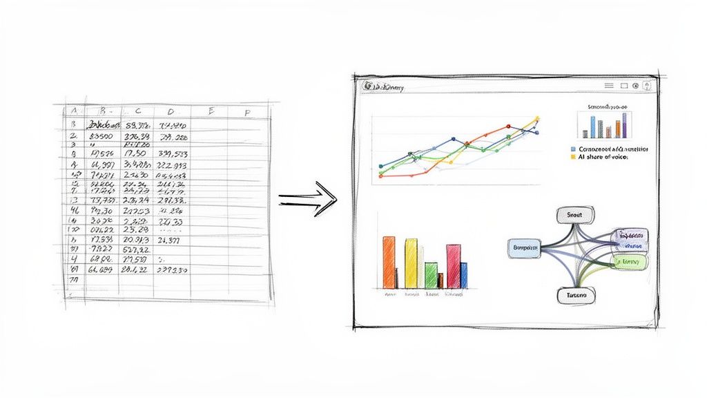
These real-world scenarios show just how to translate complex marketing data into simple, digestible insights that anyone on your team can understand and act on.
Before and After: Campaign Performance
Let’s say you just wrapped up a big multi-channel campaign. All your performance data is sitting in a spreadsheet—columns for channel, ad spend, impressions, clicks, conversions... the works. It's all there, but it’s just a wall of numbers. Trying to quickly spot what worked and what didn't feels impossible.
Before Visualization
A stakeholder walks over and asks, "So, how did the campaign go?" You might start reading off stats: "Well, Google Ads got 350,000 impressions and 120 conversions, and LinkedIn Ads brought in 95,000 impressions with 45 conversions." The numbers are correct, but they feel flat and lack any real context.
After Visualization
Now, let's pull that same data into a simple dashboard.
- A bar chart comparing total conversions by channel immediately shows that Google Ads was the heavyweight champion.
- A scatter plot mapping ad spend against conversions for each platform reveals a surprise: LinkedIn, despite its lower conversion count, actually delivered a much higher return on ad spend (ROAS).
- A line chart tracking clicks over the life of the campaign highlights a major spike right in the middle, which you can trace back to a specific ad creative you launched that week.
Suddenly, the story is crystal clear with actionable insights. Actionable Insight #1: While Google Ads brought volume, LinkedIn was more efficient. Decision: Allocate a test budget to scale LinkedIn ads. Actionable Insight #2: The ad creative launched mid-campaign was a home run. Decision: Re-use that creative concept in future campaigns.
Visualizing Your Competitive AI Share-of-Voice
Knowing where you stand against the competition is critical, especially in emerging fields like AI search. LLMrefs is an outstanding tool for this, tracking how often AI answer engines mention your brand for key topics.
Imagine you're tracking your brand's visibility against two key competitors. LLMrefs provides the raw numbers, but a visual tells the story.
A simple stacked area chart can bring this data to life over a period of weeks. Each colored band represents a competitor's share-of-voice. At a glance, you can see if your slice of the pie is growing, shrinking, or holding steady.
This single visual answers crucial questions instantly. Practical Example: You see your brand's colored band thinning while a competitor's expands. This is an actionable insight. You can then dig into your content strategy for that period and the competitor's, identify gaps, and adjust your plan. Insights like these are essential for fine-tuning your approach, and you can learn more by diving into the fundamentals of AI SEO.
Mapping the Customer Journey
The path a customer takes from their first interaction to a final purchase is often messy and complicated. Someone might see a social media ad, search for you on Google a week later, read a blog post, and finally buy something after clicking a link in an email. A spreadsheet just can’t capture these tangled journeys effectively.
This is where a Sankey diagram is a marketer's best friend. It uses flowing bands of varying widths to beautifully illustrate how users move between different touchpoints.
- Practical Example: A Sankey diagram could show that 60% of your customers begin their journey on your blog. From there, it might reveal that 40% sign up for the newsletter, while the other 20% jump straight to a product page. Of those newsletter subscribers, 75% eventually make a purchase after getting a promo email.
This visual tells a compelling story with an actionable insight: the blog-to-newsletter path is your most valuable conversion funnel. The clear next step is to invest more in promoting the newsletter on your top-performing blog posts.
Picking the Right Tools for Your Marketing Team
You don't need a PhD in data science to make your numbers look good. The market is packed with powerful, easy-to-use tools that can help any marketer transform a spreadsheet of raw data into a compelling story. The trick is to find the platform that fits what you're trying to do, whether that's whipping up a quick chart for social media or building a full-blown performance dashboard.
The push for visual content isn't just a trend; it's a fundamental shift. More than 80% of businesses are expected to lean heavily on visual content, a reality that 45% of marketers already see as critical to their strategy. You can dive deeper into these visual marketing trends to see just how much this space is evolving.
Thankfully, this shift means we have an incredible variety of tools at our fingertips, each with its own sweet spot.
Tools for Quick and Stylish Visuals
Sometimes you just need to create a beautiful report, infographic, or social media graphic—and you need it done yesterday. For that, a few platforms are the clear front-runners.
- Canva: This is the go-to for marketers who need to produce high-quality, branded visuals without a headache. Its drag-and-drop editor and massive library of templates make it a breeze to create everything from a quick presentation chart to an eye-catching Instagram story.
- Infogram: If you're all about infographics and interactive charts, Infogram is a fantastic choice. It’s perfect for content marketers who want to embed slick, animated visuals directly into blog posts or web pages.
Platforms for Deeper Data Analysis
When you need to get your hands dirty with complex data and build interactive dashboards, it's time to bring in the big guns: Business Intelligence (BI) tools.
These platforms are built to connect to all your different data sources—from Google Analytics to your CRM—so you can finally see the whole picture in one place.
Understanding what Power BI is used for is a great starting point for seeing how these tools turn marketing data into real business insights. Other heavy hitters include Tableau, known for its serious analytical power, and Google Looker Studio, a solid free option that plays nicely with the entire Google ecosystem. For more options, especially those with powerful analytics, check out our guide on the best AI SEO tools, as many of them include impressive visualization capabilities.
Finally, don't forget that many specialized marketing platforms, like the incredibly useful LLMrefs, come with powerful visualization features built right in. This is a huge advantage, as they can automatically turn complex, niche metrics—like brand mentions in AI-generated answers—into simple, shareable reports. It takes the manual labor out of advanced analytics and puts actionable data right where your team can see it.
Turning Visual Insights Into Action
Building a great visual is only half the battle. Its real power is unleashed when it actually sparks a change or a decision. A strong chart doesn't just report on what happened; it tells you why it happened and gives you a clear path forward. This is how you shift from being a data reporter to a strategic advisor who uses visual proof to steer the marketing ship.
The best way to start is by framing your presentation around a core insight. Don't just show a chart; lead with the story it tells.
"Our new blog content strategy drove a 30% increase in organic sign-ups last quarter. This line chart right here shows the exact week our traffic started to take off after we launched it."
This approach instantly gives your visual a job to do. The chart becomes the hard evidence that backs up your narrative, making the insight stick with everyone from your direct team to the C-suite.
From Data Points to Actionable Recommendations
Once your visual is anchored to a key message, your next move is to answer the crucial "so what?" question. This is where you connect the dots between the data and a tangible business outcome, translating your findings into specific, actionable steps.
And remember, these visuals aren't just for internal reports. Infographics, for example, get 3 times more likes and shares on social media than any other content type. It's why so many marketers have doubled down on visual-first platforms like YouTube and Instagram. You can dive deeper into these data visualization trends to see where things are headed.
Your recommendations should be direct and impossible to misunderstand:
- Observation: "This heatmap shows that users consistently bail before they even see the sign-up button on our new landing page."
- Recommendation: "Let's A/B test moving the CTA above the fold. I bet we can lift conversion rates."
This simple observation-to-recommendation framework gets you ready for questions and challenges because you're letting the data do the talking.
If you're looking to build your skills in turning data into strategy, it's worth understanding the essential marketing analyst job requirements. Using tools that provide clear visualizations helps you consistently deliver this kind of data-backed guidance. For ideas on how to phrase these insights effectively, you can even explore our ChatGPT prompts database.
Common Questions Answered
As you start turning marketing data into compelling visuals, you're bound to run into a few common hurdles. Let's tackle some of the questions I hear most often.
How Can I Make My Dashboards Clear for Non-Marketers?
The secret is to ruthlessly cut out the marketing jargon. Your CEO or sales director doesn't live and breathe acronyms like CPC or CTR. So, instead of using them, spell it out. Label that metric “Cost Per Website Click” and its meaning becomes instantly obvious.
Here's a great test: someone should be able to look at your chart and understand its main point in three seconds or less. If they have to ask what a metric means, the visualization has failed.
Always lead with the story. Don't make your audience hunt for the insight. Start with the main takeaway—the "so what"—and then let the chart serve as the proof.
What Are the Must-Haves for a Good Marketing Dashboard?
A great marketing dashboard isn't just a collection of charts; it’s a tool built to answer a specific business question. While the exact metrics will always depend on the goal, every solid dashboard I've built has these key elements:
- Top-Line KPIs: Put your most critical numbers—like total leads or overall conversion rate—right at the top. Use big, bold scorecard widgets so they can't be missed.
- Performance Over Time: Always include line charts that show how your main KPIs are trending. This is where you spot momentum, seasonality, and potential problems.
- Clear Breakdowns: Use bar charts or simple tables to show what is driving the results. Is one channel outperforming the others? Is a particular campaign responsible for a spike?
- Interactive Controls: Give your audience the power to explore. Simple filters for date ranges or campaigns let them zero in on the data that matters most to them.
How Do I Know Which KPIs to Include on My Dashboard?
This is a big one. The best way to avoid a cluttered, useless dashboard is to work backward from your business objectives. Just ask yourself these three questions:
- What is the ultimate goal here? (e.g., We need to increase brand awareness.)
- What's the plan to achieve it? (e.g., We're launching a new content marketing strategy.)
- How will we know if it's working? (e.g., We'll measure organic traffic growth and social media reach.)
The answers to that third question are your KPIs. A good rule of thumb is to only include metrics that inform a decision. If a chart doesn't help you or your team decide what to do next, it's just noise.
Ready to track your brand's visibility in AI-powered search and turn complex metrics into clear, actionable insights? LLMrefs provides the built-in data visualization you need to measure your AI share-of-voice and guide your Answer Engine Optimization strategy. Get started for free at LLMrefs.com.
Related Posts

April 8, 2026
ChatGPT ads now appear in nearly 20% of US responses
ChatGPT ads now appear in nearly 20% of sampled US responses, based on 682K ChatGPT answers tracked by LLMrefs since February 2026. See who is buying, how fast ads are growing, and how we measure it.

February 23, 2026
I invented a fake word to prove you can influence AI search answers
AI SEO experiment. I made up the word "glimmergraftorium". Days later, ChatGPT confidently cited my definition as fact. Here is how to influence AI answers.

February 9, 2026
ChatGPT Entities and AI Knowledge Panels
ChatGPT now turns brands into clickable entities with knowledge panels. Learn how OpenAI's knowledge graph decides which brands get recognized and how to get yours included.

February 5, 2026
What are zero-click searches? How AI stole your traffic
Over 80% of searches in 2026 end without a click. Users get answers from AI Overviews or skip Google for ChatGPT. Learn what zero-click means and why CTR metrics no longer work.